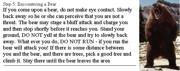
Design is much more crucial than many people realize. It is not merely something that dresses up information; design is how users interact with data. In professional and technical fields, we sometimes make the mistake of thinking that we can get something to work and then just make it pretty and useable later. This is a major conceptual flaw, and it is a significant reason why whether you love or hate Apple, you have to admit that they are financially successful and culturally significant. (Read this short article from Useit.com for one take on this issue.) More than perhaps any other company its size, Apple has an understanding of the importance of interface and design, and how they are inextricable from function. Bad design also has a pragmatic impact. Read this post from kottke.org (including link) about the recent Tropicana juice package redesign. Then read this post from kottke.org (including links) about how PepsiCo was forced to undo its product redesign because it stunk. Notice that the objections really don't have to do with how pretty the designs are; the comments have to do with how design actually facilitates or hinders access to the product. You might think this is minor, but PepsiCo is a giant company, and they just had to issue a major mea culpa and change the product design back because of consumer response. This is not a situation that you would want to be in as a designer. The point here is often discounted, but it is absolutely correct and clearly has tangible business implications: design matters, because design is product interface. Our products are documents, and design is no less important in this context. A person could devote a lifetime to studying design, but there are some simple principles that can be grasped quickly and that make a huge difference in documents. Technical Communication Today provides five principles of design: balance, alignment, grouping, consistency, contrast. I use these to help me make judgments about design, and I will discuss other issues here. Qualities of Good DesignFirst, good design is invisible. This means that good design allows readers to pick up a document and find the information they want effortlessly. When was the last time you picked up a newspaper and thought "Wow, this is really well designed!" It is more likely that because it was well designed, you picked it up and started reading the articles you wanted. Only when there are problems with the newspaper design—say, the alignment is off or its contrast is bad—would you notice the design. This is not to say that your brain isn't responding to the design. Design is noticed by the brain, but it happens more quickly than we can realize and articulate. For example, this BBC News story reports that viewers make judgments about website design in about one 20th of a second. The frame established in this snap judgment, which is made before any kind of content transmission can occur, dictates the viewer's relationship to the document. Therefore, the second quality of design is that good design is persuasive. It persuades or dissuades readers from reading your document. It also lets them know how professional, credible, and competent the document is. Good design establishes the ethos of a document before any of the content has an opportunity to do so. Though people may not be aware of it, good design will make them trust you and your information more. Think how you can tell when an email is phony. It is almost always mechanical issues (spelling, strange title, awkward prose) that tip you off before you actually read the content (that is, if you haven't already identified the email as phony and moved on). The third quality of design is that good design guides the eye. It helps direct readers' line of vision to follow the relevant tasks in the relevant order. It helps readers find the most important information effectively. It removes all visual clutter and helps readers focus in on what they need to know. We will analyze good and bad instructions to explore this. Bad directions confuse you so that you don't know where to look and how to proceed. Good directions, conversely, guide you from one step to the next. In guiding the eye, it is not just the text, bullets, lines, and graphics that help, though these elements are important. White space also guides the eye. This is because of the fourth quality of good design: good design incorporates white space effectively. White space is not empty space to be filled with content, but part of the overall design. It is breathing room for the eye (kinda mixed metaphor there). It is the background that provides the contrast necessary for good design. This article on white space from A List Apart provides a useful discussion of how white space functions as a design element. So as you design, think about white spaces. Your readers will respond to them (consciously or not), so you are responsible for using them well. Design is frustrating, because after you conceive and execute your design, you still have to go back over everything carefully to make sure that every little detail is worked out. Quality five is that good design requires careful attention. The grading standard for your instruction sets is that they could operate within the professional world. It's a high standard, but also necessary for success in current and future employment. Therefore, the difference between an A and a B project will often be the extra hour you spend printing out and revising your instructions to fine tune every detail. Design ExampleLet's look at an example of how design principles show up in documents. Say you were writing instructions about what to do if you encounter a bear:
This passage has some problems that may not jump out but that affect the design of the section. First, the design has a problem from a usability standpoint. Who, when facing a wild bear, is going to sift through this paragraph and grasp all these details? Panic will overwhelm cognition, so information needs to be perceived as quickly as possible. Second, why is "DO NOT RUN" halfway through the paragraph? That likely is the reader's first instinct, so it needs to be addressed immediately. Third, the design has problems from a design principles standpoint, which end up affecting usability. There is an alignment problem—the line across the bottom does not sync with the bottom of the picture. Also, lack of consistent repetition is a problem. Some steps are capitalized and some are not. Contrast is also an issue, because the title of each step is smaller than the step's instructions. These issues may not necessarily matter to someone facing a wild bear, but which bear encounter manual will people trust: one that is professional and flawless or one that looks like it was slapped together in PowerPoint and reproduced on a photocopier? Seemingly small details establish an overall ethos. In a professional situation, this means the difference between success and failure. A revision of this work might look like this:
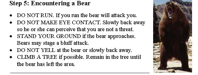
This is not necessarily the ideal design, but you can see improvement, and you can probably identify other potential improvements as well, such as adding a more usable graphic, aligning the top of the picture with the title, and fixing the contradiction between Standing your ground, slowly backing away, and climbing a tree. More importantly, you are now able to articulate the improvements based on usability and design principles. Remember these design principles as you are putting your project together. Good design leads to improved usability and ethos, and will persuade users to read your document. Using GraphicsBefore closing, I want to say a few words about graphics in your instructions projects. Screen Captures: When dealing with screen captures, use only the relevant part of the screen. Use a photo editing program to get rid of unnecessary elements. Following the principle of consistency, make all screen captures the same shape and the same dimensions unless there is a necessary reason to deviate. Don't make some images rectangular and some square, or some small squares and others large squares. This will confuse users and look ugly. (As you become more experienced, you will identify instances when it is the appropriate choice to violate consistency, but it's important to have a solid understanding of how consistency functions before you try to work against it.) Also, consider emphasizing important parts of screen captures; circle important elements, or use arrows to define and point out features. Finally, make sure your captures are aligned well in the overall document. Photos: Digital photos are another great source of images. To get good photos, you should use a good digital camera, not a cell phone camera. Like screen captures, photos should be the same size, shape, and orientation throughout your document unless there is a specific reason to change these aspects. Consider lighting when taking pictures. You want pictures to be well lit, especially because users likely will need to see things in close detail. Also, keep your lighting consistent. Don't take some pictures of your truck outside and some in the garage, because the difference in lighting and background color will be noticeable and violate the principle of consistency. You can use a photo editing program like Photoshop or Fireworks to edit the coloring on your photos or to turn them into grayscale images to make the look consistent. Also, frame and crop pictures carefully. Get all unnecessary elements out of your picture. Picture quality is determined as much by what is excluded as by what is included. Finally, make sure your photos are aligned well in the overall document. Good luck in producing your instructions. Feel free to contact me with questions. |