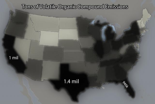
Tons of Volatile Organic Compound Emissions
Submitted by Adam on Tue, 09/11/2007 - 16:26.


Things may be a bit hazy.
Additional numbers to follow. Color-coding from light gray to black relative to emissions. A key may be needed for such a message to get across.
Would a key possibly eliminate the need for individual numbers? Your thoughts.
-Adam
The maps sense of purpose seems to be to show which states have the highest numbers of volatile organic compound emissions. The title is mainly what makes me think that. Without the title it would be impossible to know. The audience for this map isn't clear to me, but i'm guessing that it might be for government or regulatory agencies to see which areas need the most improving. The context for the map would maybe be in a magazine, or perhaps even on the news to show the general public how bad the areas they live in really are. The strategies that the map uses would be to have the darkest areas be the areas with the highest emissions, which to me reminds me of dense smoke. I think that works really well. The medium is an image, and its not clear whether it will eventually be on a web page or in a magazine, or somewhere else. The map is arranged as a standard map of the US with a title at the top. There is some text on only the states that have the highest emissions. I do like that each state's color does not have a clear cut line, but instead is faded or slightly blurry. This also makes me think of smoke or pollution. As i said before, the darkest colors meaning the highest numbers also makes good sense, but I would think that it might help to have a legend that went along with the numbers. I would put in a legend regardless of whether you decide to keep the numbers on the states. Not having one is the weakest point in my opinion cause even though i may know that the whiter areas have less emissions that the darker ones, I have no idea how much lower they really are.
Submitted by Bdawg8569 on Tue, 09/11/2007 - 16:56.The map labels the amount of emissions that each state puts out. The shading and clear distinction between states lets us know of the comparison. The audience could be for people deciding where to live or people wanting to start a new business. It could also be a lobbying point for congress to decrease the allowable emissions in the states, because the darkness of the map makes it look like a bad thing to have so much emission. The map uses a grayscale and statistics. It is very plain and bold. Not much confusion in it. The map could be anything from a poster to something posted in a website. It could be on a states webpage to show businesses how much emissions they allow, or be used in a presentation as a visual aid. The arrangement is simplistic and forthright. A key or a box of statistics could be added. The numbers in the states help differentiate the severity of the colors. The blackness is the strongest element. It helps visualize the fact that there are many emissions in the state. I think that a mild color scheme could be added. Instead of black and white, maybe blue to black, showing clear skies –then smog. But there should definitely be a distinction to the severity of the emissions. Numbers would work well.
Submitted by mhorstme on Tue, 09/11/2007 - 16:57.I believe the sense of purpose is to inform people of the amount of pollution in the U.S. and attempt to get people to try and reduce emissions from vehicles.
Submitted by Mrmann on Tue, 09/11/2007 - 17:00.A possible audience is car manufactures as well as car consumers. The goal of the map is to convince manufactures to produce cars that have lower emissions and consumers want to buy cars that have lower emissions. Both are audiences to resolve the problem on two fronts.
The context of this map would be at an environmentalist group meeting or perhaps a presentation to a car manufacturer with the goal of getting them to produce lower emission cars.
This map uses different shades of gray and black to get the message across. States that have higher emissions have a much darker shade even black for states like California and Texas. The use of this shading is to probably represent the amount of smog in the air from the amount of car emissions. This will help people realize the problem and hopefully affect some kind of change.
The medium will most likely be a presentation of some kind. It would seem to fit a slide show that also presents statistics and numbers about the emissions in certain states and probably overall pollution in the United States. It could also be displayed on a web site for many more people to see and hopefully convince people to make or use vehicles with lower emissions.
The strongest element of this map is definitely the shades of gray that it uses to represent emission levels. These are clear indicators to people about the amount of emissions that come from vehicles in that state.