Julie J.'s Data Map
Submitted by jajansen on Tue, 09/11/2007 - 16:29.


I have yet to input all of the correct contact information, and I'm waiting on a few more pictures, but here's the general idea.
There are actually 8 pages total -- one for each set of families.
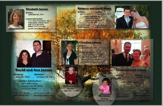
Sense of Purpose- Family tree. I conjecture this by way of the tree graphic background and the continuity of a family name across the people displayed.
Audience- The audience would probably be members of a family looking for an attractive way to display their family tree. Geneology and all that. The graphics are key to audience desire, as the design does not actually add additional information to the trees.
Context- A family needs a tree displayed for history. Or perhaps someone is researching geneology and pictures aid their search. A personal stake for the user seems implied in the construction of a family tree, so one can allow for more desire on his or her part for a useful and pleasing graphic display. Which this data map provides.
Strategies- The graphics add some attractiveness to the display, but otherwise the family tree is still a family tree. The additional layout design, portraits, and graphics make for a more dynamic look, but somewhat at the loss of an easily read display.
Medium- Online viewing could allow for additional opportunities for contact information and perhaps more photos or descriptions. A framed print display could also be considered, depending on user needs.
Arranged- It seems to follow the family tree format, i.e. parents->child->child's child etc. but seems a bit cluttered when compared to a normal bracketed family tree.
Strongest- Graphics. Pictures of members, tree background, soothing greens, all are combined to make a professional-looking display for the data.
Weakest- Arrangement somewhat cluttered and hard to follow. Perhaps defined roles or flow would help make sense of it.
Submitted by Adam on Tue, 09/11/2007 - 17:19.This is a family tree of the immediate family. A tree is in the background and half the people have the same name. The audience would be this person’s family members. I could see this appearing in a calendar or in a picture frame with other family pictures. I can defiantly see this medium as a picture or some sort of paper…. Inside a frame or a calendar. I love the background. I also like how the birthdates and contact information is by the picture. This would be an excellent thing to see when you walk in your door to remind you to keep in touch with family. I am confused about who’s child is whose… but a family member would not be. ( Oh… this could also be made into a fridge magnet… so family members could be added or taken away as necessary.) The people in the map don’t flow too well together. It is hard to tell where the children fit into the poster. But again… that might not be important for a family who knows each other. The poster is very pleasing to the eye, which I believe is important for the family. Why is there blue under the parents picture? I think the strongest element is the background of the poster. It seems to help bring things together. I think that the variability of the poster needs to be easy to accommodate. People grow up quickly and an updated picture or extra people would be nice to have.
Submitted by mhorstme on Tue, 09/11/2007 - 17:20.The purpose of this data map is that the audience of it will have easy access to important information about the Jansens, such as ways to contact, birthdays, etc. The audience would be either the Jansen family or perhaps close friends of the family because of the personal information that is used. This map would be used as a guide for who’s who and how they can be contacted, especially in the case of emergency. The map uses a great background that really unifies the family pictures. It does a fairly good job of contrasting the pictures and information. The final medium would probably be a handout in the form of a booklet, since there are multiple pages. This fits with the easy access idea for the audience. The arrangement is good because the only part that draws the most attentions is the information and photo on the bluish background. Perhaps this couple is where the rest of the family stems from. An idea might be to find some way of organizing the information, such as alphabetizing it for quick searching. The strongest element is the layout with the grayish areas that contain the information and photos of the people. An area of improvement is maybe showing who the two children belong to and perhaps how everyone relates to the others.
Submitted by sarlwils86 on Tue, 09/11/2007 - 17:30.