Data Map - Second Draft _ Jason Ortiz
Submitted by jdortiz on Wed, 09/12/2007 - 22:45.


Thanks for the comments. I adjusted some things and added data to better serve my purpose.


Thanks for the comments. I adjusted some things and added data to better serve my purpose.
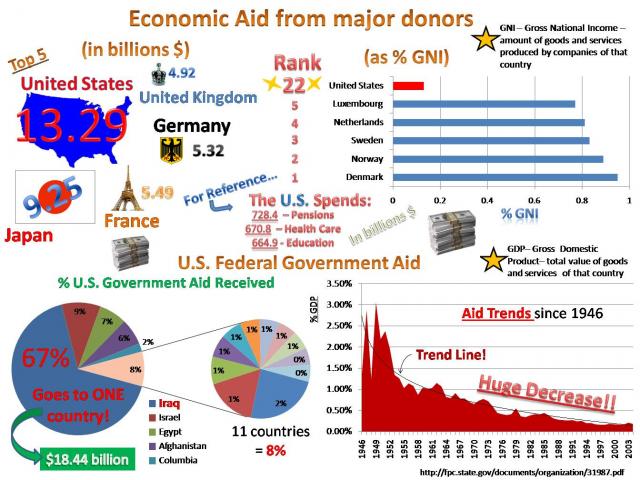
It looks like you have a lot of data here. I wonder if it isn't too busy to be comprehensible. You might remember that one of the elements of the iconographics that we looked at in class was that it can be difficult to extract meaningful data from them. Indeed, that is one of the strategies they use, because in many of the iconographics the point isn't to get data from them—it is to be overwhelmed by it. This helps transmit their somewhat negative portrayals of the position of the US in the world.
In looking at this document, I'm not sure what it is communicating. Is your purpose satirical? Is it literal? Regardless, you want to make sure that your document is accomplishing its purpose for its audience. Keep that in mind as you continue to revise.
Submitted by jtirrell on Sat, 09/15/2007 - 19:33.