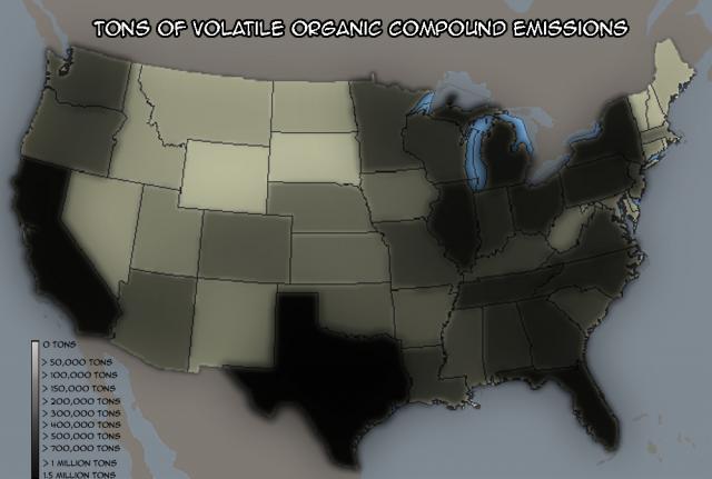
Tons of Volatile Organic Compound Emissions
Submitted by Adam on Thu, 09/13/2007 - 16:28.


Didn't like numbers because they cluttered the piece, detracting from the effect (in my mind)
Added a scale key. I actually think it could stand to be even hazier to dramaticize the whole thing a bit. Possibly add a chart/blurb to contexualize the information with some findings about the amount of damage these emissions cause to US citizens.
This looks pretty interesting, and it seems that you are using colors in support of your topic, which is good. One thing I'm curious about is what this map does that couldn't be done, for example, in a list. What does this image do that textual data alone does not?
Submitted by jtirrell on Sat, 09/15/2007 - 18:02.