image galleries
David Doogs

Above is a more cartoonish representation of the brain. I did not create this image, but when I do create mine, it will be kind of similar to this one. I plan on doing two different images of the brain, one male & one female so comparison will be easy. I will exaggerate the parts of the brain that are associated more with sexual arousal. For example, men are stimulated more visually, therefore the occipital lobe will be largely unproportionate to the rest of the brain. Women are stimulated more emotionally so the amygdala will be larger. I plan on sizing the parts of the brain based on level of stimulation. So in men, the occipital will be largest and the parietal, which controls touch, will be smallest. What I need help with is thinking of more simplistic names than occipital and parietal. For example, I thought of calling the occipital lobe the "visual master".
read more | 7 comments
Rough of map

Here is the rough draft of my map. I've included a picture of the newsroom with all of the editors at their desks and also descriptions, split up by desk, editors and their duties.
I haven't had a chance to plop the descriptions on the map since it took some time to coordinate all of the editors being in the office at the same time, but I will soon.
Feedback questions:
Is there any more information you want to know about the newsroom besides where the editors are?
Do you want to know how many reporters each desk has, how they work together, which computers are available for reporter use?
read more | 7 comments
Interactive Continents Map

This is a very rough draft of my first project. The final product will be in flash, thus making it interactive. Above image shows one of the layers.
On the bottom, there's a navigation menu which allows you to choose what type of demographical data that you would like to see, or you can choose the continent to see all of its demographical data. On bottom right, the data is displayed in the traditional way, numbers.
Obove example, which is population indicated by the red circle, bigger it is, bigger the population is.
1.) I need two more data categories, any suggestion?
2.) How can I make this more readable?
read more | 8 comments
Auto Cross Map of Columbus

My map is to show useful places to go in the Columbus, Indiana area on a typical day of auto crossing.
1. Does any one have suggestions for a better way to show the gas stations and what they have?
2. Is the map legible and easy to understand?
3. Is there any type of places not show you would think should be?
Wal-Mart

Do you understand what my poster is trying to display?
What would make the poster more effective?
What information does this poster leave out that you would like to know about the topic?
Does this poster bring about any specific emotions?
Disney's Magic Kingdom Map
1.Which map do you prefer visually to find phones/bathrooms?
2.Find Frontierland. Which map took longer to find it?
3.Which map is easier to use to find a meeting place?
4.Which map do you think saves you the most time on finding certain things in the park?
5.Which map do you think is the most practical to use on vaction?
First Draft: Musical Melting Pot Map

URL for actual started website: http://web.ics.purdue.edu/~darinm/
1. Are my arrows sufficient enough to stick out on the map and give you a good enough visal representation?
2. Does the basic design look professional?
3. Are you in the audience of people that would be looking at this map? If so, where would you best want to access it from?
Road Map Test

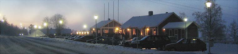
My project will take sections of map such as the above and add the little G,R,etc things to show placements of restaurants, gas stations, lodgings, etc.
I will also be differentiating them by adding subscripted numbers that reference to information printed to the side of the map.
Questions:
1) There are two sizes of Gs and Rs on the map. Which is a better scale? I believe the larger one works better.
2) For the subscript, I was thinking that if I used the larger sized image for the actual type, I could use the smaller numbers for the subscript if I attached them to the actual image. Agree/disagree?
read more | 5 comments
Mapping Internet and Cable Providers

This map is roughly covering the areas I wanted to show. I am going to use a color code or a symbol key for the map showing which cable and internet companies are available in certain areas of West Lafayette.
Feedback Questions:
1. Since West Lafayette is somewhat large should I just focus on areas right around campus like appartment complexes or try to complete all of West Lafayette.
2. How detailed should I get regarding the cable and internet providers. Should I just focus on the larger companies?
Point Of View

Sean Lambert, Valerie Nyczak
~~~
Point of View is fundamentally the idea that the subject changes depending upon the perspective of the viewer. This can be visually achieved through use of tools such as forced perspective, spatial relativity, etc.
Escher's "Relativity" is a good example of the point of view argument because it forces the viewer to re-orient their up and down depending upon the stair-case actively being viewed.
Source:
http://britton.disted.camosun.bc.ca/escher/relativity.jpg